
Be My Eyes
Micro Help Volunteering app who wants to expand their user base.
Context
Project overview
Project overview
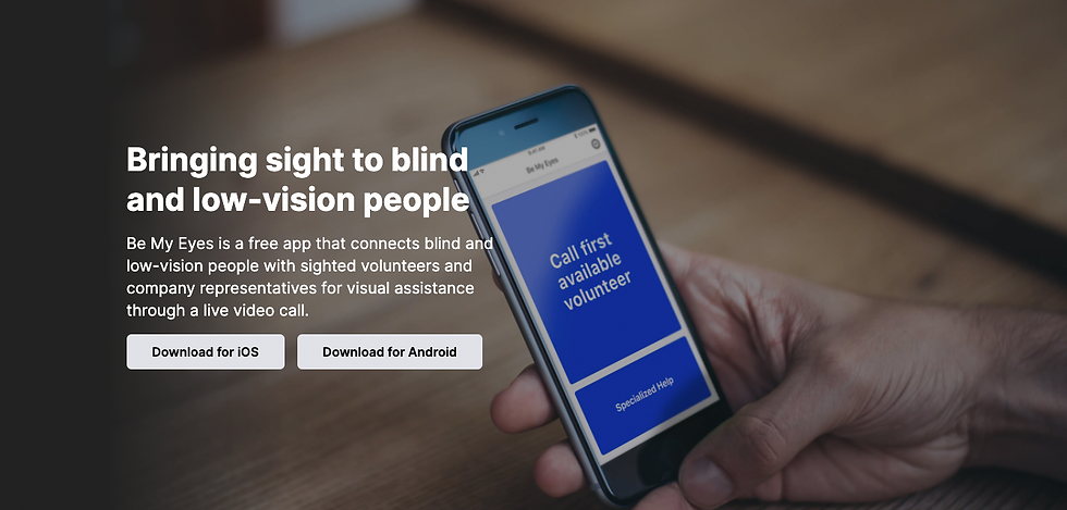
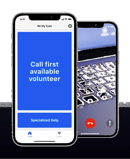
Be My Eyes is a service which connects blind or low sighted volunteers for visual assistance in everyday tasks ranging from changing a lightbulb to making a cup of tea.
To date over 5 million volunteer provide valuable support as Be My Eyes which shows the popularity and success of this app. This social action service cannot be underestimated, it’s about inclusion, accessibility and giving those who need it a trustworthy service using skilled volunteers.
The brief
The brief was to expand the user base of the service to a broader audience by looking at the core needs related to micro help. Be My Eyes had a hunch that people who look for ‘how to help’ Youtube videos might like a more personalised and tailored experience and that’s where we come in.
Project details
Client: Be My Eyes
Project type: Conceptual, Group
Year: 2021
Role: UX Student Designer
Duration: 2 weeks
Tools: Miro, Marvel and Figma


Process
Empathise / Define / Ideate / Prototype / Test
User interviews
Competitive and Comparative Analysis
Affinity mapping and How Might We Statements
Persona
User flow and journey
Sketching
Body Storming
Wireframes and Usability Testing
High Fidelity Prototype and Iterations
Research
We carried out 4 interviews regarding how people currently use the internet, what they value and any blockers. The main takeaways focused on the need for volunteers to provide specialist advice and for guidance to be practical and broken down into steps.
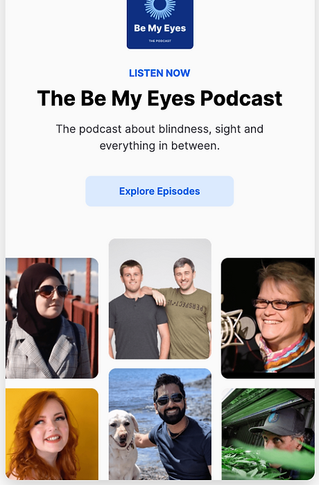
BE MY EYES PODCAST
Keen to explore why Be My Eyes matters to those who need it. Additional research led to the following Podcasts hosted by blind and low vision presenters. Their stories, their challenges and why Be My Eyes makes a different was both inspiring to hear and led our group discuss key issues around accessibility and an intuitive navigation system.
Competitive Analysis
Plus and Delta

Insights
Users valued a quick and reliable service by skilled professionals who have been rated for their skills
Users tend to avoid organisation with bad customer service and appointment cancellations
Feature Inventory
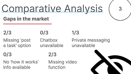
Insights
Both Chatbox and ‘how it works’ functions were missing from all 3 services and therefore considerations for our design ideas.
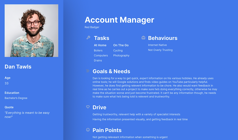
Persona
So meet Dan Tawls!
Problem Statement
Dan needs to get immediate and trustworthy help with micro-tasks because he is not confident he can do it himself and finds the current methods of getting relevant and reliable information to be a chore.
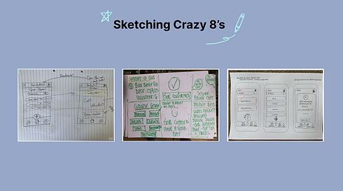
Sketches and testing
Sketches
We wondered where to go with the sketching when there were 3 of us, resulting in us timeboxing some crazy 8’s. We started by focusing on the homepage, followed by a profile of the user's needs and motivations. We discussed all ideas and voted on our favourite designs for user testing. The red and yellow circles shown in the sketches to the right highlight the winning design features.

Body Storming
When doing crazy 8’s we came up with the problem of having your hands free to hold the phone, while solving the issue.
We tested this with the simple task of making a cup of tea with 4 users. We found that one user propped his phone up on the side of the kitchen, having both hands free to listen to the volunteer and what they were wanting them to do. This is a major issue that we had to consider as many tasks are when people are outside, such a changing a car tyre.
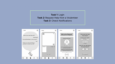
Initial Wireframes
Following on from the Crazy 8’s and body storming we created a medium fidelity wireframe. We gave our users the task of logging in, connecting with a user and checking their notifications following this call.
Usability testing
We tested our wireframes on 12 users. The red red markers highlight some of the main points we changed.
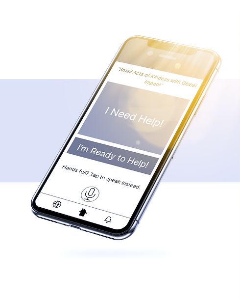
The first pair of screens, show iterations on our wording in the speak function. We made the replies clear, solutionising any problems that might occur with accents, as well as frustrations with immediacy.
The second pairing displays our choice to enlarge our camera screen. 50% of our users were confused with the smaller screens, so we made the users screen larger than the volunteers. This is because it is important the user sees what they are showing the volunteer, to put a finger on what really is wrong.
The third pairing shows many iterations we made to the connection screen. Our users were unsure if Dave was online, leading us to add an active bubble.
8 of our users were unsure as to what +20 meant. We added a familiar like icon which when further tested was evidently understood.
Many of our female users were unsure about the safety of being connected to a man they were unfamiliar with. This was an important issue we hadn’t thought about so we therefore gave a choice of 3 active users, still getting the immediacy but allowing a choice before being connected.

Moodboard and Desirability
Moodboard
To find the colours for this project we started with a tone of journey, and mood-boarded images and colours that related to trustworthiness and confidence to make sure we had this reassurance the users said they needed. We used inter as the font because it’s what Be My Eyes uses to keep that brand symmetry.
We then looked at colours we felt related to the key words we wanted to represent the brand, and how the colours change when the tone moves from Fun to Serious, or Concise to Detailed.

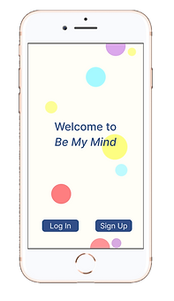
Welcome to
Be My Mind
The name was a happy accident when I misspoke during one of our discussions and it stuck with all of us, and we thought it represented this evolution from helping people to see, to now helping people with all manner of tasks they don’t know how to do.

Grey to Colour
Brand Symmetry
We settled on blues for an air of trust, greens for calm and yellow because of its energising nature, and then did another mini design studio to see how these colours would work with the prototype.
High Fidelity
Our high fidelity run through touched on all the key functions from our research and insights.


Iterations and next steps
For the next steps we’d like to
Add a ‘hold’ option to the phone call so people can pause but not have to hang up
Sketch out and test the search flow, as a lot of the users wanted to use the search function rather than selecting a category
Build out the rewards system for the volunteers, perhaps based on reaching milestones in how much they’ve been endorsed

Reflections and learning
Good UI starts with good user research. I wanted to understand why this product mattered. What positive impact does this app make to its users. The design team were brilliant at taking these insights, putting the various components of the project together and driving us forward with sketches, mid-fidelity and testing.
This project really showed me the importance of testing your designs. The different research methods we used, through 12 Usability Tests, Desirability Testing, Body Storming etc. really gave us a final product that was grounded in user feedback. It was also great working in a group, and not being precious about our ideas. We aligned incredibly well in our daily stand ups, and always iterated based on what we learnt, not sticking to ideas because we liked them.
Useful collaborative designs are the result of tiny lightbulb research moments so enjoy the ambiguity and discovery James, I keep telling myself.
Thank you for reading.